I find all the Christmas pets to be beautiful, though at first glance, the results kind of left me disappointed. Not because the art is subpar; but only because I feel like the fire theme was pushed too much, and in what I feel was in identical ways. If the theme was fire and ice, I feel like there are more ways to show fire/hot than the ways that were used for this year's pets.
My point is that these pets basically all look the same:
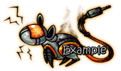
They basically all have the exact same fire theme, and use the exact same colors, just about. They're not
ugly or
unlikeable; just very
similar. Even their names have little that separate them; Ash, Fried, Burnt, Flare.
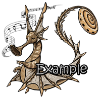
The Draught Trumpetter is a good example to show what I mean by using the fire theme differently. It's not black or grey with fiery colors; it's muddy, and representing a very dead set of colors; as in what happens, usually, when a draught happens.
The melted Insonia is amazing and most likely my favorite from this year. Both sides look absolutely amazing.
I also feel like the 'ice' part of the theme wasn't really... exposed as much? These are the ones I can see as icy:
Which is four compared to:
... a total of seven, which is almost double. I'm counting the Aura and Squeaker as two different pets, because that's what they are; they're also sporting very slightly different colors.
Maybe it would've been cute to have one or the other be an ice bird? So one grows into a phoenix, and the other into an arctic bird. It could've been a cute theme, and a cute parallel to the Melted Insonia, since the Aura and Squeaker go together; so one half is ice, one is fire.
Fire could've been shown, say... in a volcano? Rocks? Steam? Draught was a very creative way to represent it (assuming it's... meant to be part of the fire side of the theme?).
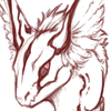
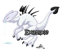
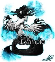
I also... I don't know, something bothers me about the head of the Scancia Sygriff. Idk if it's because it's bald and it looks funny to me... I feel like maybe the head looks small? Hm. Or that it had a long neck. I'm not sure what it is. That one might just be me.
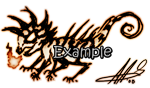
Really love the Alien Quiksylph, even if I don't know if I would find a use for it, myself; it just looks really great. I especially love the tail and how "confusing" the markings are; confusing in a good way. I can't think of a better word.
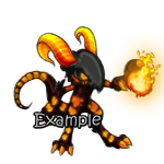
I also really do love the Torken too. Like Freezair said, I'd love to see it without the fur, and with the full face. That'd be a really cute alternate lineart to the Torken.
Again, I want to make it clear:
NONE OF THEM ARE UGLY. I'm just saying, I feel like the pets were very, very similar this year. Admittedly, they do all seem to have add-ons, but yeah.
There's only a few I'd trade away, so it's not because I dislike them. But, if you were looking for constructive criticism, that's what I thought when I first saw the boxes open this year.